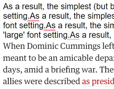
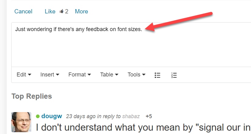
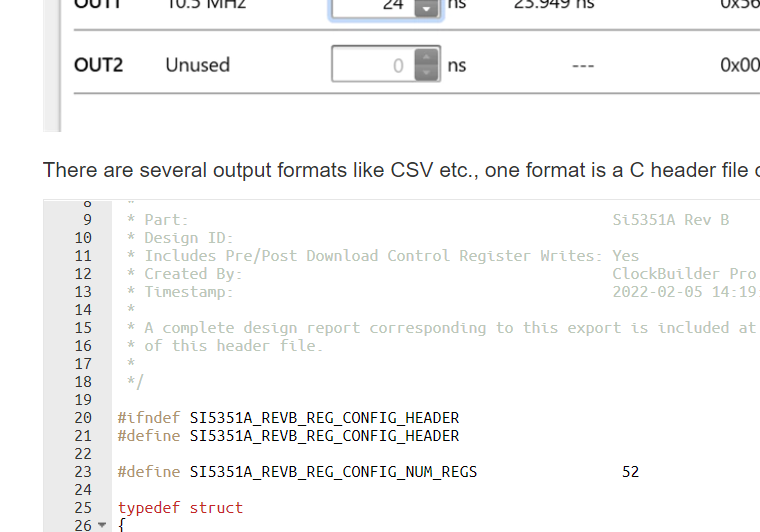
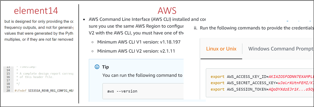
Hi, the default font is really small, the image below compares it to this Guardian page (both at 100% zoom setting on Chrome. For sure we can improve things by changing the zoom setting for the page, but I don't feel users should have to do that unless they have unusual requirements or have unusual sized displays and so on.

As a result, the simplest (but I feel bad, but we have no choice currently) solution is to currently select the 'large' font setting. However, the line spacing looks very bad by doing that. Again, a comparison with the Guardian page shows the difference in line spacing: .

Polling


