Hi,
The editor boxes have some issues.
Using Chrome on Windows Desktop, I see this:

As you can see in the screenshot above, I don't have any editor menu options in the red box, but the green box has the options. Furthermore, the amount of space is tiny for the box shown in red. I don't get what's wrong with providing generous space for comments, it makes people want to write in paragraphs when the box is naturally bigger. It's easier for the user to edit too, without scrolling.
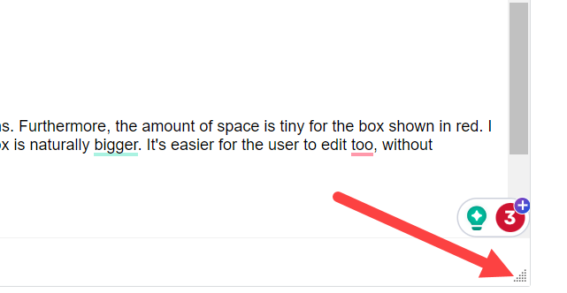
Next issue is, when creating content, the editor box is too small. The triangle that should resize it, has never worked (for me at least) ever since Verint was used. I believe this is just with Chrome, it seems to work with Edge (I don't know if it always works with Edge, but it never works with Chrome).

It wastes a lot of time scrolling around in a tiny box when creating content with Chrome, and that is one of the most popular web browsers. I believe this was raised a couple of times before, so Verint must be aware of it. I was curious is there any planned date or release for this to be resolved? Are they aware it's frustrating?
Also, there is still the issue of the editor somehow inserting some tag that makes images squashed. This impacts every reader who then reads that blog post or comment. I can reliably reproduce it, even if Verint cannot. I believe I have also recorded a video demonstrating it in the past. What debug is required, to resolve it?
