Howdy folks!
You might recall that the web platform that the element14 Community program was updated recently, and adding in quite a few cool new features. Not least of them being a lavish lick of digital paint in the profile area.
As this has been quite a big improvement on the old profile system, it prompted us to take a fresh look at the whole area of acquiring membership in the first place. So as of next week, being 5th April, we're also taking the opportunity to give registration a bit of an update.
This isn't particularly going to affect those of you who are already long registered, but you know how we like to keep you updated anyway 
Registration Changes
These tweaks that newcomers will see in the registration form align us more closely with that of the family of element14 transactional websites (Farnell, Newark and so forth), and uniformity is never a bad thing. Assuming your uniforms don't look like this, anyway:
Yikes.
Where was I? Ah yes! The new registration form.
Job Role
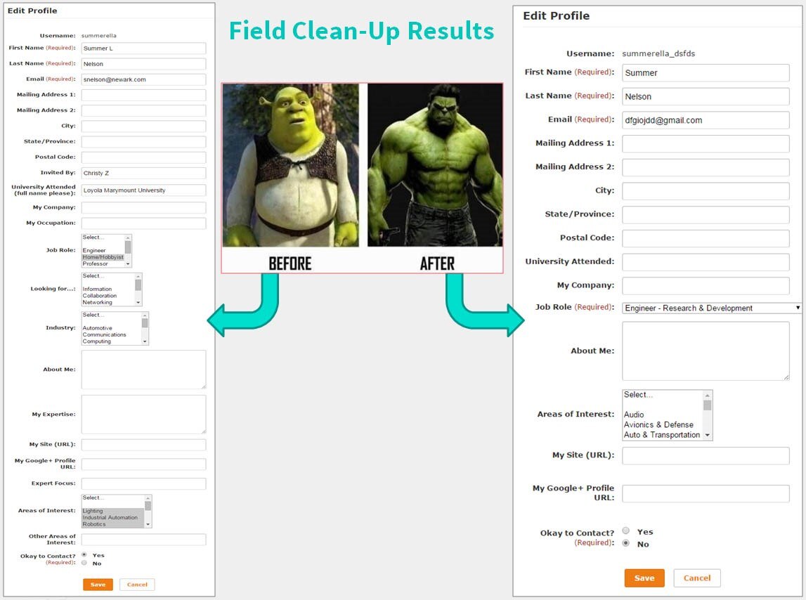
This is the big difference. We've had similar before now, but as far as the system's concerned, "Job Role" is a brand new field. Not a big deal in itself, but here's where you need to pay attention.
As you're already registered prior to these changes next week, and you go in to edit your existing profile, you'll have to put something in this new "Job Role" field before you can save your changes. It won't affect you if you don't edit your profile, just remember you need to put something in "Job Role" if you do.
Field Order
We solicited a bit of advice from user interface gurus, and rearranged some of the fields for a quicker, more logical flow, and we removed a couple or three that weren't getting used all that much, like "Invited by" and "Other". If you filled these in when you previously registered all the same info will remain, though.
Changes and Additions
Otherwise, it's all pretty simple stuff. Some entries in fields like "Areas of Interest" have been expanded to include a lot more options, but the majority of the existing options have been seamlessly mapped over to their new counterparts, so again, nothing much for you to do there unless you fancy updating your profile to make use of the newer options.
As always we're keen to get your feedback, and we'll drop y'all another line next week when it's all live. In the meantime, here's a look at the sexy new streamlined registration form in comparison to the current one.


Top Comments