


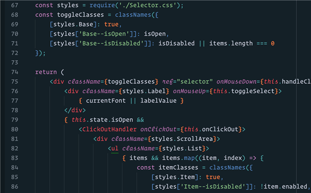
A sample of what Operator looks like. Created by Hoefler & Co this font focuses on tricky punctuation (via Typography)
Typefaces affect how we see things. There's the standard Times New Roman that you can't go wrong with or the dreaded Comic Sans, which is met with derision. Not only is font an important element is reading and typing, it's also important when it comes to coding. Operator Mono, founded by Jonathan Hoefler, is a new font that's supposed to make life easier for programmers.
Hoefler got the idea from Monospace or fixed-width typefaces, which are closely related to vintage typwriters. He wanted a similar font to use in programming with some fine tuned adjustments. “In developing Operator,” says Hoefler “we found ourselves talking about JavaScript and CSS, looking for vinyl label embossers on eBay, and renting a cantankerous old machine from perhaps the last typewriter repair shop in New York and unearthing a flea market find that amazingly dates to 1893”
Operator pays special attention to things like brackets, braces, and punctuation marks, which often make or break a code. The font is also supposed to make it easier to identify the difference between I, l, and 1 or colons and semi-colons by using color and italics making them easier to spot in endless code. The font comes in two varieties: Operator which is natural width and Operator Mono which is fixed width. Both are available in nine different weight from thin to ultra and includes both roman and italic small caps throughout. Both types are supported by companion ScreenSmart fonts, which are designed for user in browsers at test sizes.
Those interested in the font can purchase it starting at $200 from Hoefler & Co. It's a hefty price to pay to make programming easier, especially when there are a number of alternatives out there. A quick Google search will bring up the best fonts to use for programming. They range from Consolas to Monaco. Sites like Slant will even show the pros and cons of each type of font along with where you can get it. Many of the fonts are inexpensive, some are even free.
Operator has good intent behind it, but people who have been programming for years may not want to pay that much to have color and italics added to their typeface. Seasoned programmers know the errors and trip ups they have to keep an eye out for, so maybe this new font won't appeal to them. But for those who are new to the field and have extra money to burn may want to look into this new typeface.
Have a story tip? Message me at:
Top Comments