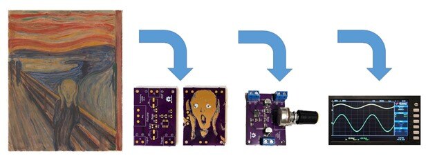
This is the final post in a three part series on how to create an audio amplifier using the classic TI LM386 which has been further adorned with PCB art. The method for transferring art work to a PCB was described in the first post. The LM386 amplifier design was documented in the second post. In this post a summary of the art transfer process and amplifier design is presented, the PCB is populated, and the audio amplifier tested.
Transferring Art to PCB
The PCB art is based on the famous work by Edvard Munch called The Scream. The method used is based on the work of Andrew Sowa, with the main difference being my workflow uses Photoshop and converts the image to grey scale using the "magic wand" to isolate layers rather than a color conversion using Adobe Illustrator to create the bit map for KiCad as Andrew does. The modified layers are brought into KiCad and converted into a footprint as shown below. For additional information on the methods used see my first post here.
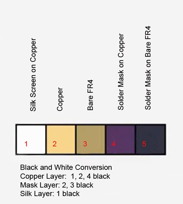
A palette of colors is created with the bare FR4, copper, solder mask, and silk screen. The palette resulting from purple OSHPark boards is shown below.
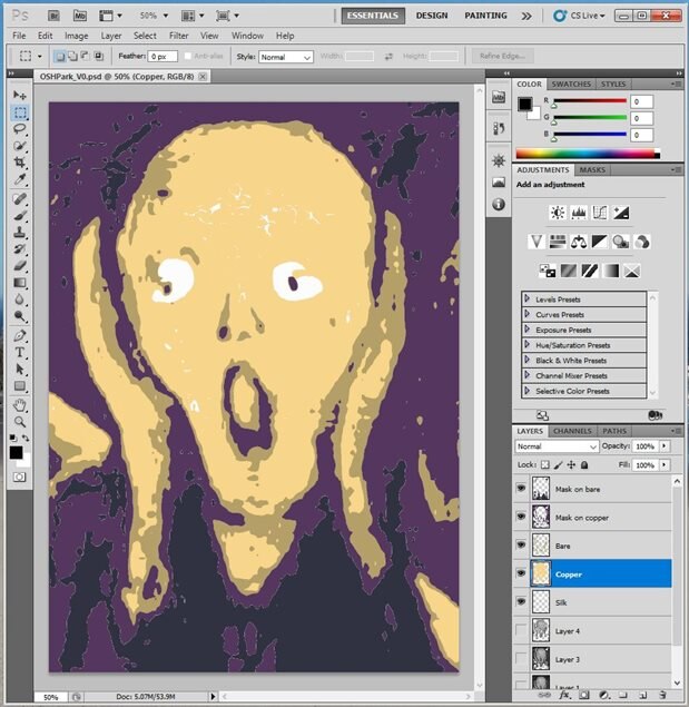
By converting to a grey scale image in Photoshop and then adjusting by trial and error it is possible to isolate the layers corresponding to the palette above. The layers below have been shaded with the palette and are the ones used in this project.
| {gallery} Photoshop Layers |
|---|
|
Silk on Copper |
|
Copper |
|
Bare FR4 |
|
Solder Mask on Copper |
|
Solder Mask on Bare FR4 |
|
Stacked View in Photoshop |
Before exiting Photoshop the layers are converted back to a pure black and white image before importing into KiCad. That process is straight forward although a bit tedious and results in a component footprint as shown in the image below.
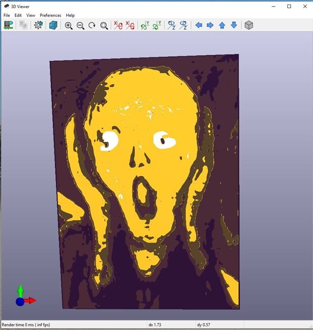
The resulting render in KiCad looks like this:
Amplifier Design
The amplifier is based around the LM386 as described in this post. The design is taken from the LM386 datasheet but includes almost all of the optional bells and whistles.
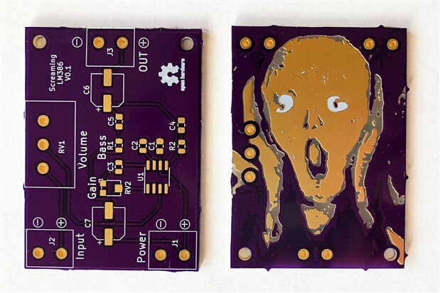
When creating the PCB itself it was eventually decided to use the art work as a ground plane on the two layer board as it covered most of the bottom side. Surface mount components were used for the most part on the front side so as not to unduly deface the art work.
The resulting unpopulated PCB as received back from OSHPark is shown in the photo below.
I thought the finished product looked great!
As noted in the video discussion of the PCB below, the main change I would make would be to increase pad sizes, especially of the trimmer used for gain. Bringing gain out to a full sized potentiometer and adding a potentiometer for bass boost could also be considered if board size is not a consideration.
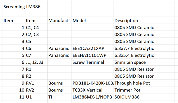
The final bill of materials is given below. The small gain trimmer has been updated in this list to show the preferred part.
Discussion of the PCB
The video below gives more discussion on the aesthetics of the board and how the components were soldered to the PCB.
Audio Tests
In the video below several tests are done to see how well the amplifier compares to the datasheet.
Summary and Conclusion
The artwork turned out much better than expected. However, I should note that the response I got from most engineers at the local Hardware Happy Hour where I showed it around last week was either a dull stare or ''it looks like a lot of work". People who don't know much about PCBs don't really get it either. But there have been enough nerds who showed excitement (and recognized The Scream) to encourage me to try this type thing again.
The LM386 performance met the datasheet specifications but newer Class D amplifier designs are available which are more efficient and have additional features. For testing this design it would have been nice to bring both the Gain and Bass Boost out to full sized potentiometers.
Thanks for reading and comments are always welcome.
Links








Top Comments
-

baldengineer
-
Cancel
-
Vote Up
+4
Vote Down
-
-
Sign in to reply
-
More
-
Cancel
-

fmilburn
in reply to baldengineer
-
Cancel
-
Vote Up
+1
Vote Down
-
-
Sign in to reply
-
More
-
Cancel
Comment-

fmilburn
in reply to baldengineer
-
Cancel
-
Vote Up
+1
Vote Down
-
-
Sign in to reply
-
More
-
Cancel
Children