element14 Community
element14 Community
    Register Log In
  • Site
  • Search
  • Log In Register
  • About Us
  • Community Hub
    Community Hub
    • What's New on element14
    • Feedback and Support
    • Benefits of Membership
    • Personal Blogs
    • Members Area
    • Achievement Levels
  • Learn
    Learn
    • Ask an Expert
    • eBooks
    • element14 presents
    • Learning Center
    • Tech Spotlight
    • STEM Academy
    • Webinars, Training and Events
    • Learning Groups
  • Technologies
    Technologies
    • 3D Printing
    • FPGA
    • Industrial Automation
    • Internet of Things
    • Power & Energy
    • Sensors
    • Technology Groups
  • Challenges & Projects
    Challenges & Projects
    • Design Challenges
    • element14 presents Projects
    • Project14
    • Arduino Projects
    • Raspberry Pi Projects
    • Project Groups
  • Products
    Products
    • Arduino
    • Avnet Boards Community
    • Dev Tools
    • Manufacturers
    • Multicomp Pro
    • Product Groups
    • Raspberry Pi
    • RoadTests & Reviews
  • Store
    Store
    • Visit Your Store
    • Choose another store...
      • Europe
      •  Austria (German)
      •  Belgium (Dutch, French)
      •  Bulgaria (Bulgarian)
      •  Czech Republic (Czech)
      •  Denmark (Danish)
      •  Estonia (Estonian)
      •  Finland (Finnish)
      •  France (French)
      •  Germany (German)
      •  Hungary (Hungarian)
      •  Ireland
      •  Israel
      •  Italy (Italian)
      •  Latvia (Latvian)
      •  
      •  Lithuania (Lithuanian)
      •  Netherlands (Dutch)
      •  Norway (Norwegian)
      •  Poland (Polish)
      •  Portugal (Portuguese)
      •  Romania (Romanian)
      •  Russia (Russian)
      •  Slovakia (Slovak)
      •  Slovenia (Slovenian)
      •  Spain (Spanish)
      •  Sweden (Swedish)
      •  Switzerland(German, French)
      •  Turkey (Turkish)
      •  United Kingdom
      • Asia Pacific
      •  Australia
      •  China
      •  Hong Kong
      •  India
      •  Korea (Korean)
      •  Malaysia
      •  New Zealand
      •  Philippines
      •  Singapore
      •  Taiwan
      •  Thailand (Thai)
      • Americas
      •  Brazil (Portuguese)
      •  Canada
      •  Mexico (Spanish)
      •  United States
      Can't find the country/region you're looking for? Visit our export site or find a local distributor.
  • Translate
  • Profile
  • Settings
Community Hub
Community Hub
Member's Forum Feedback Requested: Table of Contents Navigation Menu on RoadTest Reviews / Project Articles / etc.
  • Blog
  • Forum
  • Documents
  • Quiz
  • Events
  • Leaderboard
  • Polls
  • Files
  • Members
  • Mentions
  • Sub-Groups
  • Tags
  • More
  • Cancel
  • New
Join Community Hub to participate - click to join for free!
Actions
  • Share
  • More
  • Cancel
Forum Thread Details
  • Replies 31 replies
  • Subscribers 533 subscribers
  • Views 3652 views
  • Users 0 members are here
  • roadtest reviews
  • project articles
  • table of contents
  • navigation
Related

Feedback Requested: Table of Contents Navigation Menu on RoadTest Reviews / Project Articles / etc.

cstanton
cstanton over 1 year ago

Hey everyone,

This thread is duplicated in  Feedback Requested: Table of Contents Navigation Menu on RoadTest Reviews / Project Articles / etc. for reach to members, you can comment on either thread and voting in the poll will be reflected in both threads.

I'd like your feedback on the table of contents/navigation menu that we have mainly on RoadTest Reviews, but also on the Project Articles that we have recently introduced for Project14.

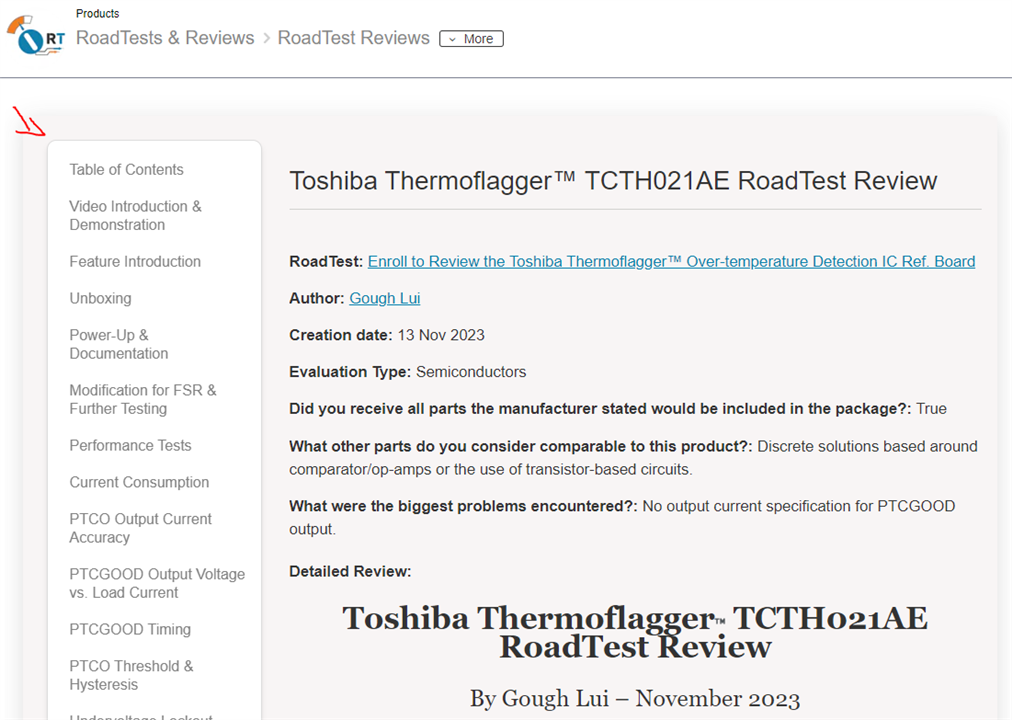
From a tablet, laptop or desktop computer, the navigation currently renders like this:
image

It is automatically generated by using header tags in the content, respecting H2 to higher numbers for sub-sections, headings should always go in the order from H1 to a higher number resulting in smaller headings for sub-sections. H1 is usually preferred for the title of the content and is automatically on the page.

The headings are also highlighted in bold when you scroll down the page, and the navigation persists. Though this can cause a couple of issues, such as the navigation taking up screen real-estate, and it also nudges the content over to the side of the page rather than using the full width.

On a mobile phone or narrow device, however, the navigation looks like this:

imageimage

On mobile, the navigation should be 'sticky' and remain at the top of the screen, particularly if you scroll 'far' down or up, and it auto switches to which heading section you're in.

What's the Question?

Should we make the desktop experience the same or similar to mobile? Here are the options:

In this poll, I am using the word 'static' to mean that you can scroll down the page, or up the page, and you can scroll away from it. You will no longer see it when you navigate away by browsing the rest of the content on that page.

I am using the term 'floating' to mean that it stays with you, it 'floats' on top of content, or perhaps next to it, and travels with you when you scroll the page, you do not browse away from it.

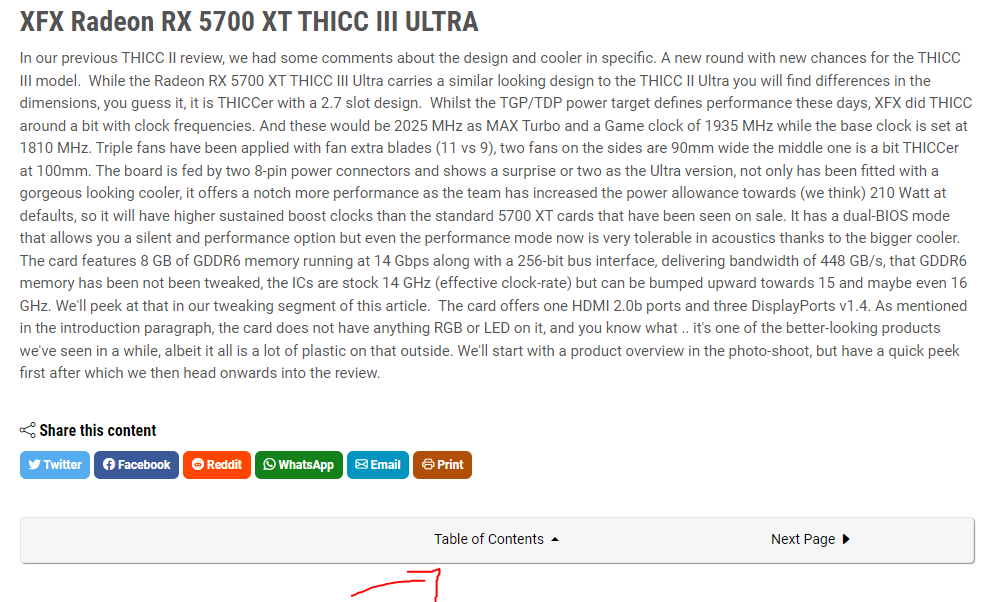
I thought I would add a 'bottom of the content, static, but a drop-down' because there are sites such as Guru3D where this is exactly what it's like. Nothing overly fancy, and it doesn't detract from reading the content first, which is mostly what you're hear to do when you land on the page. Here's an example: https://www.guru3d.com/review/xfx-radeon-rx-5700-xt-thicc-iii-ultra-review 
image

Though on their site you then have to scroll for the options, but I like how it shows the sub headings:

image

Let me know by voting and leaving a comment

  • Sign in to reply
  • Cancel

Top Replies

  • Jan Cumps
    Jan Cumps over 1 year ago +2
    Leave like is on PC screen. No TOC on mobile (even no sticky if possible) - where the widget takes a decent chunk of prime readable text area. I don't know how many have a mobile phone with a screen…
  • michaelkellett
    michaelkellett over 1 year ago +2
    I voted to remove the navigation but (based on the Thermoflagger RoadTest) which looks like this on my screen: Half the screen is wasted with static or semi-static content. I'd lose the right hand…
  • jc2048
    jc2048 over 1 year ago +2
    I voted for "Remove the navigation, tell us why below". A table of contents serves a purpose in a book with hundreds of pages. Particularly in a technical textbook that may not be read in a linear manner…
  • beacon_dave
    beacon_dave over 1 year ago

    Fly out from the side

    imageimage

    • Cancel
    • Vote Up +2 Vote Down
    • Sign in to reply
    • Cancel
  • dougw
    dougw over 1 year ago

    I don't have a strong opinion. I don't currently use the ToC for anything, but I don't mind it being there. I skim all content anyway, reading those bits that seem like they will be interesting.

    • Cancel
    • Vote Up +1 Vote Down
    • Sign in to reply
    • Cancel
  • electronicbiker
    electronicbiker over 1 year ago

    I find the tablet/laptop/desktop display difficult to read. Pale blue/grey on a white background does not work for me, especially in bright light. Others may think it is ok, but it reminds me of an old mobile phone I had where the text display was grey on a very slightly lighter shade of grey. Other features such as the calendar and notes were white on a black background so I knew there was nothing wrong with the phone. What's wrong with either white on black or black on white?

    • Cancel
    • Vote Up 0 Vote Down
    • Sign in to reply
    • Cancel
  • kmikemoo
    kmikemoo over 1 year ago

    Static.  Not floating PLEASE.

    • Cancel
    • Vote Up 0 Vote Down
    • Sign in to reply
    • Cancel
  • shabaz
    shabaz over 1 year ago

    Hi cstanton , could you please clarify? Web speak may mean "static" to be content that is not active and will scroll off the page, is that what you meant? As a non-web expert, for me "static" meant something that will not scroll off anywhere while the user is scrolling the main page content, but then later I tried to second-guess what you meant and thought the opposite. At least, I was confused, maybe others are not. I initlally thought static meant something that would be fixed on the screen, even if the user scrolls. But then later you refer to "floating" being "travel with you down the page". That could be interpreted two ways too. Do you have an example (or a clearer description)?

    • Cancel
    • Vote Up 0 Vote Down
    • Sign in to reply
    • Cancel
  • cstanton
    cstanton over 1 year ago in reply to shabaz

    Hey Shabaz,

    shabaz said:
    could you please clarify?

    Thanks for asking, I've added a couple of lines to define what I mean, there's also a link to a guru3d article which may help as an example for one of the poll options. Sorry for any confusion caused. Let me know if it helps.

    cstanton said:

    In this poll, I am using the word 'static' to mean that you can scroll down the page, or up the page, and you can scroll away from it. You will no longer see it when you navigate away by browsing the rest of the content on that page.

    I am using the term 'floating' to mean that it stays with you, it 'floats' on top of content, or perhaps next to it, and travels with you when you scroll the page, you do not browse away from it.

    • Cancel
    • Vote Up +1 Vote Down
    • Sign in to reply
    • Cancel
  • shabaz
    shabaz over 1 year ago in reply to cstanton

    Got it. I understand, thanks!

    • Cancel
    • Vote Up 0 Vote Down
    • Sign in to reply
    • Cancel
  • strb
    strb over 1 year ago in reply to dougw

    Same for me

    • Cancel
    • Vote Up 0 Vote Down
    • Sign in to reply
    • Cancel
  • shabaz
    shabaz over 1 year ago in reply to electronicbiker

    On mobile I'm using the browser's "dark mode" set just for the element14 website, and that works great, lots of contrast and it looks good too.

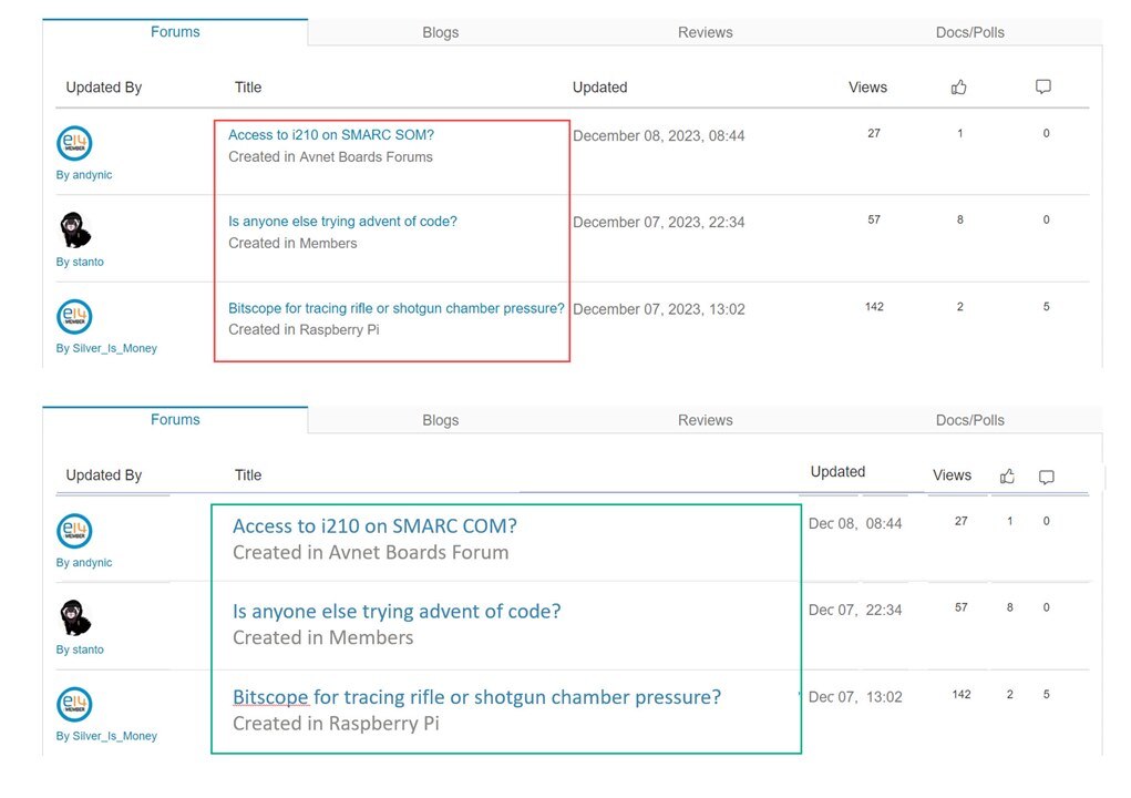
    On desktop it would be nice if the table was adjusted on the main page, to squash up the right side columns which would free up more space for larger text overall. The date doesn't need to be so long (and doesn't need the year either, it's an unimportant detail 99.9% of the time). Maybe even all the text on that list could be larger for all columns, and it would not increase the physical size of the table.

    image

    • Cancel
    • Vote Up 0 Vote Down
    • Sign in to reply
    • Cancel
  • dang74
    dang74 over 1 year ago in reply to jc2048

    You make a valid point concerning table of contents and how they are not needed.  Even with 50 page datasheets I find myself scrolling through the content until I come across the heading, diagram or waveform I'm looking for.

    • Cancel
    • Vote Up 0 Vote Down
    • Sign in to reply
    • Cancel
<>
element14 Community

element14 is the first online community specifically for engineers. Connect with your peers and get expert answers to your questions.

  • Members
  • Learn
  • Technologies
  • Challenges & Projects
  • Products
  • Store
  • About Us
  • Feedback & Support
  • FAQs
  • Terms of Use
  • Privacy Policy
  • Legal and Copyright Notices
  • Sitemap
  • Cookies

An Avnet Company © 2025 Premier Farnell Limited. All Rights Reserved.

Premier Farnell Ltd, registered in England and Wales (no 00876412), registered office: Farnell House, Forge Lane, Leeds LS12 2NE.

ICP 备案号 10220084.

Follow element14

  • X
  • Facebook
  • linkedin
  • YouTube