


Driving the Front Panel
I've been using the PA1000 virtually everyday since its delivery have been finding that this tool is indispensable for my work.
In addition to workshop use I have been using it to observe the behaviour of many different power supplies in different modes of operation such as standby, idle and fully active.
The current graphs have been fascinating.
This instalment I cover some basic operations. I haven’t fully absorbed the manual but here is what I know thus far and may appear to be goose in the process.
Buttons
The buttons have feel like membrane covered tact switches and have a very good positive feel. The power button is an alternate action click on click off push button and as a good positive feel. I just hope the spring and state swing arm are robust to provide years of reliable service.
Display
The LCD is a small 86mm (diagonal) 320 x 240 pixel QVGA colour display. It is very clear albeit small for my ageing eyes. Enlarged photos of the display show its clarity and it available colour palette.
There are various display modes available and here is a quick run down of some of them.
Parameter Mode
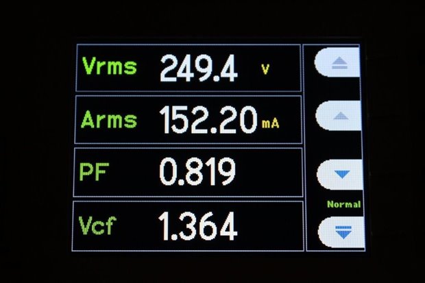
Figure 13 - Four Parameter Display Mode
By default four parameters are displayed on the LCD with an aesthetically pleasing and easy to read font. If more than four parameters have are being tracked the up and down buttons can be used to scroll the display. If one finds this display mode awkward the number of parameters can changed between either four or fourteen (albeit in a smaller font) using the menu options. The procedure to do this is not intuitive and requires quite a number of button presses.
- Press Menu button,
- Highlight View (Press down arrow 7 times),
- Select View (Press right arrow),
- Select Zoom (Press right arrow),
- Select desired option 4 results or 14 results (By pressing up and down arrows)
- Select Option – (Press Tick button)
- Press Menu button to return
- If necessary, press Graph button once or twice to switch to Parameter display mode
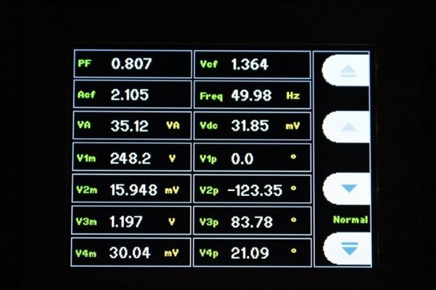
Figure 14 - Fourteen Parameter Display Mode
It would be really nice to have a single button press to toggle between these two display modes to enable the most important parameters displayed in large writing and then be able to toggle quickly to see the other tracked parameters but I haven’t found a way to do that just yet.
Graph Mode

Figure 15 - Graph Mode displaying input voltage, current and their interrelationship
The graph mode is very useful and provides information graphically for fast interpretation. Input wave forms such as voltage and current the graph auto scale to show a single wave starting at zero in both X and Y scales. From this it is very easy to identify any phase shift with voltage and current. The graphs and their annotations are colour coded with the colour to match the captions across the top of the display. Red = VRMS, Bright Green = ARMS, the Blue + & - don’t seem to have any real meaning.
Although the photo does not convey the difficulty I have reading graphs with the small screen. This can be overcome with connection to a PC via the PWRVIEW application for a much larger display.
To me there are a few confusing points of the graph. The first is the top X-axis scale. Why is it there? The second is that the time scale is devoid of any unit symbol and the third is the blue plus and minus symbol surrounding the origin. I think this confusion can be alleviated by removing the top X-Axis scale, having a period value displayed in the caption area and removing any time unit prefix scales from the time scale annotation. Below is a mock up to illustrate my point. To me this looks clearer but it is just a personal preference.
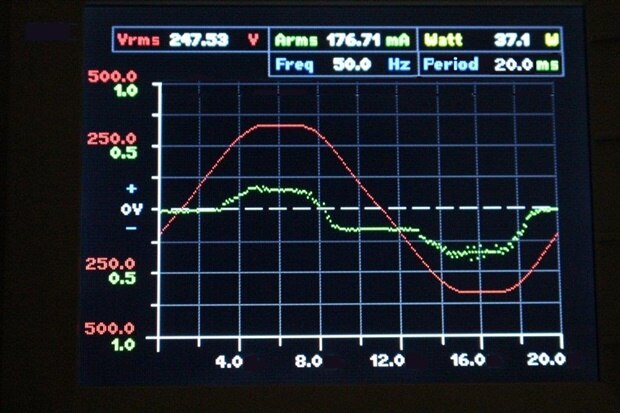
Figure 16 - My Graph display mock up
When performing real time logging the graphs are plotted incrementally as the values are encountered but I did notice that the graphing function algorithm used to set the pixels appears to have a rounding bug. For some graphing there are noticeable gaps in the X-axis for a supposedly continuous curve. (Note: These gaps are not present when the data is exported to PWRVIEW.)
A zoom function would be greatly appreciated so the technician can have a closer view of the area of interest such as a close up of any present ripple.
When displaying logging graphs of voltage, current or alike there is no obvious warning that the system is not in Integration mode. The display just sits there remaining inanimate. It would be good to have a nice friendly warning message pop up informing the operator of their error.

