


Introduction
This project builds a coronavirus chart for the Pi. There is a 7-minute video to explain it:
Here in the UK, most of the newspaper organisations and journalists (if you can call them that) behave like sycophants toward the government. We don’t get the information we need to keep ourselves safe. Instead, we get told to keep mixing and attending public events until it’s too late. Here almost two months of advance notice was squandered while China and then Italy suffered. Our leader is an outright clown, there’s no two ways of seeing it. The government actions which were universally condemned worldwide, initially encouraged ‘herd immunity’ and will now result in massive quantities of deaths.
Looking at (say) charts in the Financial Times, it is easy to further fool oneself that the trend for your country is pretty much the same as any other country.
Image snippet: ft.com, fair use to explain the problem with their chart..
Looking closer, it becomes clear that the chart vertical axis is actually logarithmic. Mathematically it may be understandable, but log charts are not understood by everyone. Is the chart deliberately intended to confuse? I think it is – it’s just a personal opinion of course. But what I do know, is when a non-log chart was shown to a sample of friends, they were astonished at what they saw.
You’d think that perhaps the official government websites could be helpful here, but that’s not true. The UK government website merely displays a few numbers presenting a static view. That’s extremely useless for anyone who wishes to see what trajectory the country is on. The 'number of cases' in no way represents the real situation either, since the quantity of testing is low.
Image snippet: UK government site, to explain the pointlessness of their information
It’s very sad, but it is now down to individuals to chart the information they want or feel they need, at this important time.
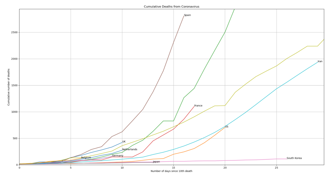
Here’s what the situation really looks like, as of 24th March 2020, for a few countries. This is actual deaths over time, it is not some prediction based on a low volume of testing, and it is on an clear unambiguous scale. On the chart, the starting point per country, and precisely what countries are plotted, is down to us.

The result is frightening.
Zooming in closer, we can now see the exceptionally mediocre state certain countries are in, and the direct consequences of poor and deliberate government decisions and the squandered time. No wonder the newspapers and the government didn’t want it to be easily visible.
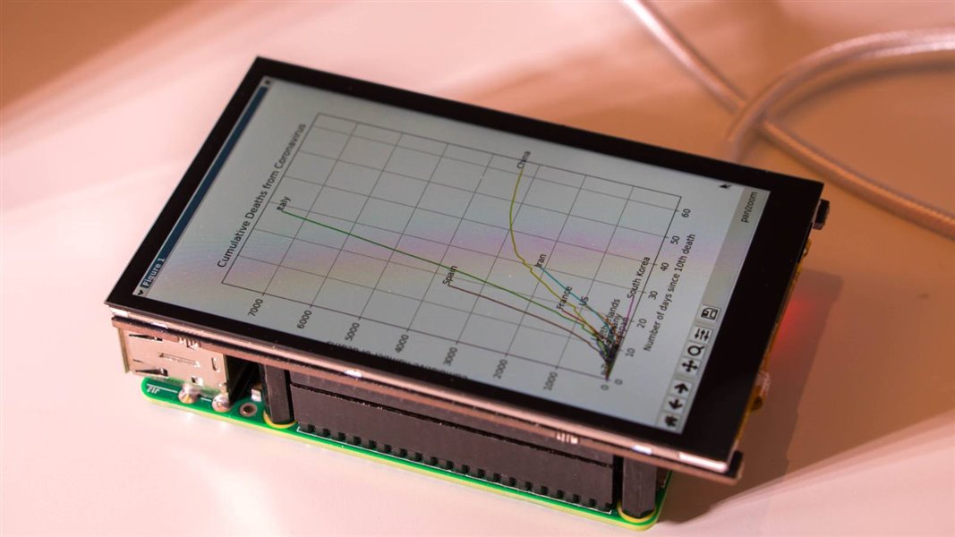
This project aims to chart the deaths from coronavirus independently from the newspaper charts, and allow navigation through pan and zoom. This project has been tested on a laptop running Linux, and on a Raspberry Pi. The reason to use the Pi is to convert it into a standard ‘kiosk-like’ device with a permanently attached touchscreen for all interactivity. At power-on the Pi will automatically fetch the latest data and chart it onto the screen, ready for navigation. No physical keyboard or mouse is used.
This project is suitable for use in any country, and the desired countries of interest can be modified in the code.
How it Works
This project takes the latest data set from John Hopkins Center for Systems Science and Engineering (CSSE). Python code is used to parse it, pull out the countries of interest and then chart it using a library called MatPlotLib.
When the code is run, it will automatically download the dataset, process it and then generate the chart rendered onto the screen, ready for browsing or for grabbing a screenshot / saving to a file.
Installing and Running the Code
To get going, at a command prompt (from any Linux machine such as a Pi, or from Windows PowerShell) confirm that Python 3.x is installed (type python3 -h and confirm you get useful output; if you don’t then install Python as superuser by typing (on many Linux systems) apt-get update and then apt-get install python3 or go to the Microsoft Windows Store and search and install from there) and then type the following. If you get an error indicating that you do not have git installed then install that too! Type as superuser apt-get install git or on Windows click here to download git.
pip3 install requests
pip3 install numpy
pip3 install matplotlib
mkdir -p ~/development/covid
cd development/covid
git clone https://github.com/shabaz123/coronachart1.git
cd coronachart1
That’s it, the software is now installed. It’s just a single file called app.py.
You can run it by typing:
python3 ./app.py
You should see a chart appear such as the example ones shown earlier.
Modifying the Code
The code relies on a CSV file that is automatically downloaded from the John Hopkins CSSE github page. CSV files can be examined in a text editor or Excel. You’ll see that there is a row per country, and the columns indicate number of deaths per day. You’ll have to scroll to the right to see the values rising.
If you open up app.py in a text editor, you’ll see lines with country names in them. They can be modified to add or remove countries. To add new countries, run the code at least once so that the CSV dataset gets downloaded to the folder you’re in. Then, open up the CSV file in Excel, and search it to find the line number. If you don’t have excel, you can use grep to search for a country name, for instance the following command reveals that Italy is in row 139 in the CSV file:
grep -ni "Italy" *.csv
Kiosk Mode
If you have a screen to attach to a Pi (either via the HDMI connector, or a plug-on display such as the Pi Capacitive Display or any of the various plug-on displays, then the Pi can be set up so that it automatically does just one task – display the chart. This is ideal if you wish to permanently dedicate a Pi and display for this purpose – perhaps as an information board with future enhancements.
To convert the Pi to work as a standalone kiosk-type appliance, follow the steps here: Home Automation in the UK Simplified, Part 2: Raspberry Pi and Touch Display
in the section titled Building a ‘kiosk mode’ for the Pi and Display. Ignore the initial steps related to Node-RED.
Incidentally, in the file called midori_start.sh, you can replace the text http://127.0.0.1:1880/ui with a news URL such as (say) http://www.bbc.co.uk/news if you wanted your kiosk mode device to permanently display the news. For this project, the Pi will display a chart instead.
Issue the following commands. The aim is to create a startup script that will run the Python code:
cd ~
cp midori_start.sh app_start.sh
Edit the app_start.sh file and replace the last line with the following two lines:
cd ~/development/covid/coronachart1
/usr/bin/python3 ./app.py
Next, edit your .bashrc file. Replace this line:
xinit ./midori_start.sh
with:
xinit ./app_start.sh
Now whenever the Pi is restarted (as superuser use the shutdown or reboot command!) the Pi will automatically display a progress bar as it waits for the network connectivity to become available, and then it will run the Python application which will download the latest data and chart it.
If you have a touchscreen, there are controls at the bottom of the display to be able to perform pan and zoom by then touching and dragging in the chart area.
Doing Useful Things with it
I hope people can make use of the kiosk chart or news facilities to present information in store windows. It would be great to hear if people manage to represent the news information in a readable manner, or translated into different languages for those who will be feeling lost in those countries where governments are not making the effort to assist them.
Also, please share any interesting code modifications, as well as any interesting charts you generate, here and to other friends so they can see useful information too.
Thanks for reading!
Top Comments