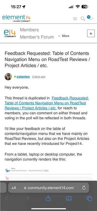
element14 Community
element14 Community
    Register Log In
  • Site
  • Search
  • Log In Register
  • About Us
  • Community Hub
    Community Hub
    • What's New on element14
    • Feedback and Support
    • Benefits of Membership
    • Personal Blogs
    • Members Area
    • Achievement Levels
  • Learn
    Learn
    • Ask an Expert
    • eBooks
    • element14 presents
    • Learning Center
    • Tech Spotlight
    • STEM Academy
    • Webinars, Training and Events
    • Learning Groups
  • Technologies
    Technologies
    • 3D Printing
    • FPGA
    • Industrial Automation
    • Internet of Things
    • Power & Energy
    • Sensors
    • Technology Groups
  • Challenges & Projects
    Challenges & Projects
    • Design Challenges
    • element14 presents Projects
    • Project14
    • Arduino Projects
    • Raspberry Pi Projects
    • Project Groups
  • Products
    Products
    • Arduino
    • Avnet Boards Community
    • Dev Tools
    • Manufacturers
    • Multicomp Pro
    • Product Groups
    • Raspberry Pi
    • RoadTests & Reviews
  • Store
    Store
    • Visit Your Store
    • Choose another store...
      • Europe
      •  Austria (German)
      •  Belgium (Dutch, French)
      •  Bulgaria (Bulgarian)
      •  Czech Republic (Czech)
      •  Denmark (Danish)
      •  Estonia (Estonian)
      •  Finland (Finnish)
      •  France (French)
      •  Germany (German)
      •  Hungary (Hungarian)
      •  Ireland
      •  Israel
      •  Italy (Italian)
      •  Latvia (Latvian)
      •  
      •  Lithuania (Lithuanian)
      •  Netherlands (Dutch)
      •  Norway (Norwegian)
      •  Poland (Polish)
      •  Portugal (Portuguese)
      •  Romania (Romanian)
      •  Russia (Russian)
      •  Slovakia (Slovak)
      •  Slovenia (Slovenian)
      •  Spain (Spanish)
      •  Sweden (Swedish)
      •  Switzerland(German, French)
      •  Turkey (Turkish)
      •  United Kingdom
      • Asia Pacific
      •  Australia
      •  China
      •  Hong Kong
      •  India
      •  Korea (Korean)
      •  Malaysia
      •  New Zealand
      •  Philippines
      •  Singapore
      •  Taiwan
      •  Thailand (Thai)
      • Americas
      •  Brazil (Portuguese)
      •  Canada
      •  Mexico (Spanish)
      •  United States
      Can't find the country/region you're looking for? Visit our export site or find a local distributor.
  • Translate
  • Profile
  • Settings
Community Hub
Community Hub
Member's Forum Feedback Requested: Table of Contents Navigation Menu on RoadTest Reviews / Project Articles / etc.
  • Blog
  • Forum
  • Documents
  • Quiz
  • Events
  • Leaderboard
  • Polls
  • Files
  • Members
  • Mentions
  • Sub-Groups
  • Tags
  • More
  • Cancel
  • New
Join Community Hub to participate - click to join for free!
Actions
  • Share
  • More
  • Cancel
Forum Thread Details
  • Replies 31 replies
  • Subscribers 533 subscribers
  • Views 3654 views
  • Users 0 members are here
  • roadtest reviews
  • project articles
  • table of contents
  • navigation
Related

Feedback Requested: Table of Contents Navigation Menu on RoadTest Reviews / Project Articles / etc.

cstanton
cstanton over 1 year ago

Hey everyone,

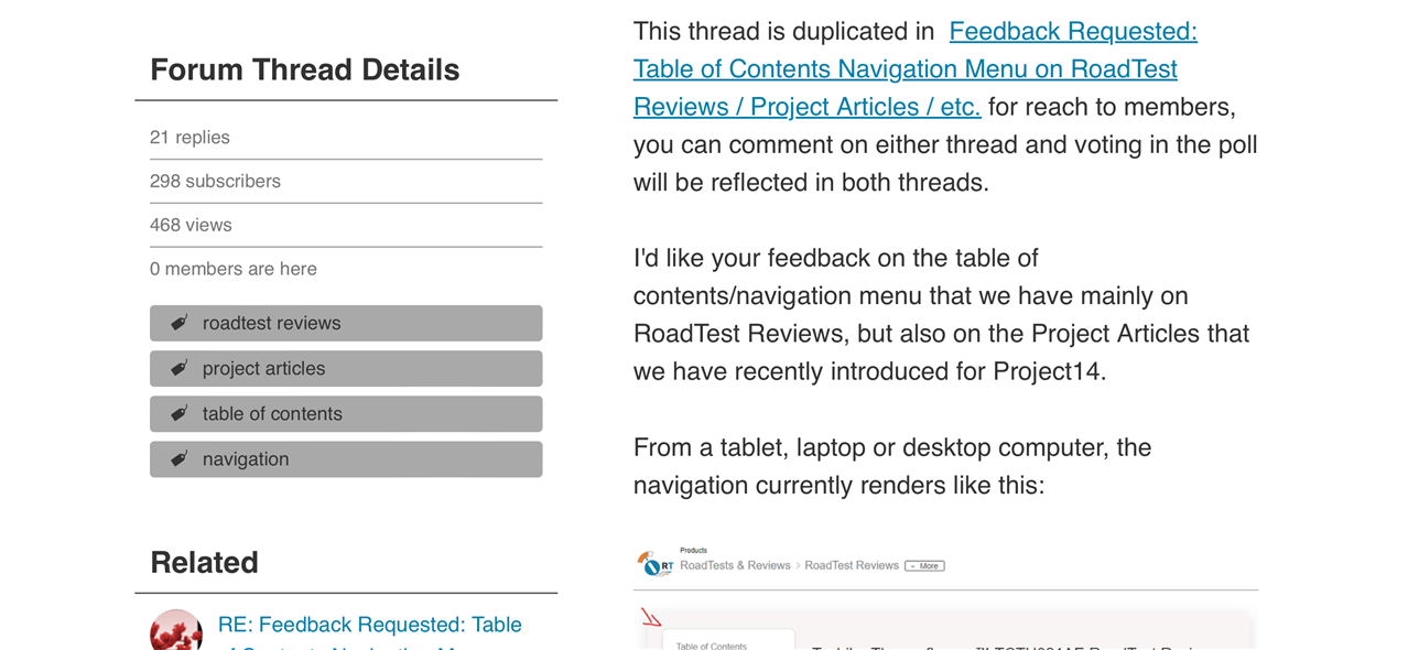
This thread is duplicated in  Feedback Requested: Table of Contents Navigation Menu on RoadTest Reviews / Project Articles / etc. for reach to members, you can comment on either thread and voting in the poll will be reflected in both threads.

I'd like your feedback on the table of contents/navigation menu that we have mainly on RoadTest Reviews, but also on the Project Articles that we have recently introduced for Project14.

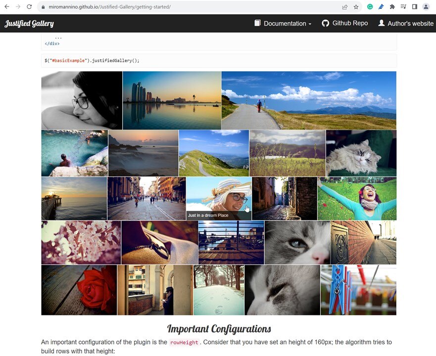
From a tablet, laptop or desktop computer, the navigation currently renders like this:

image

It is automatically generated by using header tags in the content, respecting H2 to higher numbers for sub-sections, headings should always go in the order from H1 to a higher number resulting in smaller headings for sub-sections. H1 is usually preferred for the title of the content and is automatically on the page.

The headings are also highlighted in bold when you scroll down the page, and the navigation persists. Though this can cause a couple of issues, such as the navigation taking up screen real-estate, and it also nudges the content over to the side of the page rather than using the full width.

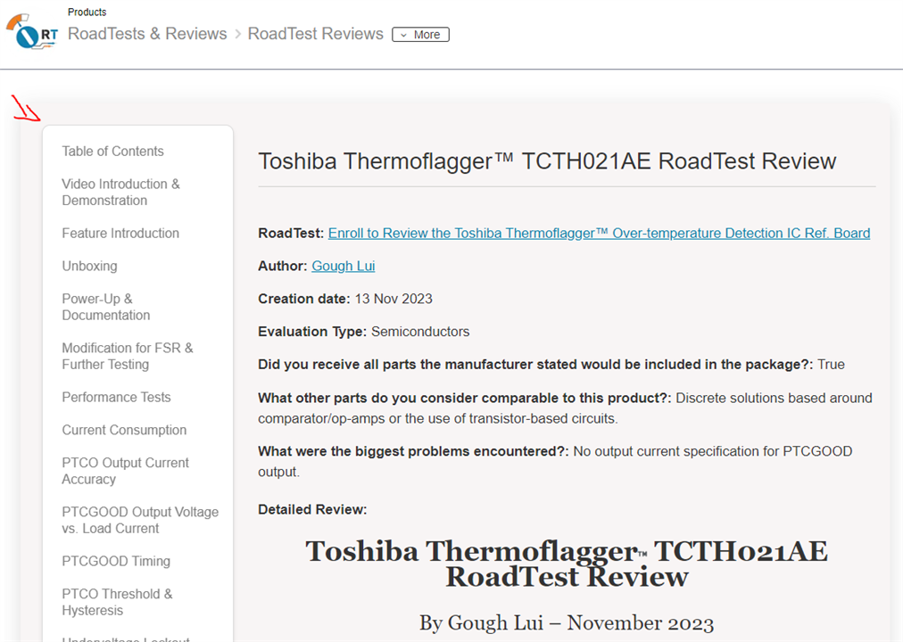
On a mobile phone or narrow device, however, the navigation looks like this:

imageimage

On mobile, the navigation should be 'sticky' and remain at the top of the screen, particularly if you scroll 'far' down or up, and it auto switches to which heading section you're in.

What's the Question?

Should we make the desktop experience the same or similar to mobile? Here are the options:

In this poll, I am using the word 'static' to mean that you can scroll down the page, or up the page, and you can scroll away from it. You will no longer see it when you navigate away by browsing the rest of the content on that page.

I am using the term 'floating' to mean that it stays with you, it 'floats' on top of content, or perhaps next to it, and travels with you when you scroll the page, you do not browse away from it.

I thought I would add a 'bottom of the content, static, but a drop-down' because there are sites such as Guru3D where this is exactly what it's like. Nothing overly fancy, and it doesn't detract from reading the content first, which is mostly what you're hear to do when you land on the page. Here's an example: https://www.guru3d.com/review/xfx-radeon-rx-5700-xt-thicc-iii-ultra-review 

image

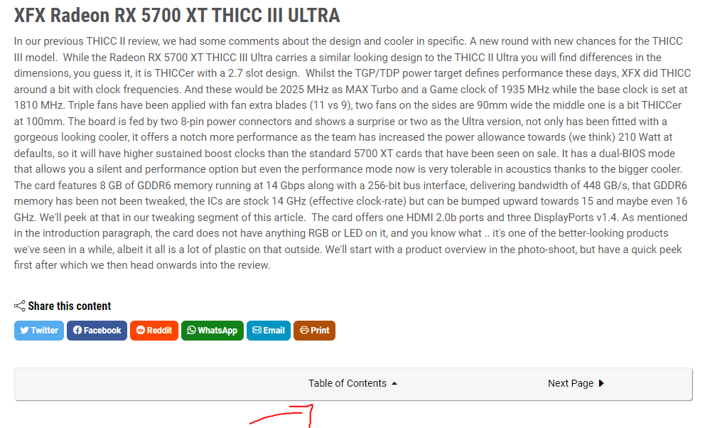
Though on their site you then have to scroll for the options, but I like how it shows the sub headings:

image

Let me know by voting and leaving a comment

  • Sign in to reply
  • Cancel

Top Replies

  • Jan Cumps
    Jan Cumps over 1 year ago +2
    Leave like is on PC screen. No TOC on mobile (even no sticky if possible) - where the widget takes a decent chunk of prime readable text area. I don't know how many have a mobile phone with a screen…
  • michaelkellett
    michaelkellett over 1 year ago +2
    I voted to remove the navigation but (based on the Thermoflagger RoadTest) which looks like this on my screen: Half the screen is wasted with static or semi-static content. I'd lose the right hand…
  • jc2048
    jc2048 over 1 year ago +2
    I voted for "Remove the navigation, tell us why below". A table of contents serves a purpose in a book with hundreds of pages. Particularly in a technical textbook that may not be read in a linear manner…
Parents
  • Andrew J
    Andrew J over 1 year ago

    I voted "different opinion".  I don't think the issue is with the ToC per se, but a general issue with site layout for different device form factors.  I expect there is a fair bit of work that goes in design for, and UAT of, different devices but I don't think it works that well.  Here's just a few examples of the site on my iPhone 15 Pro Max (full screen captures, no crop):

    {gallery}Example UI problems

    image

    This blog in Landscape: Have to scroll to actual get to the article content

    image

    This blog in landscape: Scrolled to content, half the page taken up with the left hand column with information that might be useful but better presented at the end, say.  I'd subjectively argue that Related content is more useful than Actions, which is more useful than Forum Thread Details, (but which are presented in the opposite order) but none are more useful than the post itself.

    image

    This blog in portrait: More article content which is good, but confusing top bar.  I actually pressed that + box to open up the site structure only to get the "New Blog" screen.  It's a different button on the desktop version of the site  - indeed, it's different to this page in landscape - which I didn't initially twig to.

    image

    E14 Front Page in portrait: No user content, inappropriate content wrapping, massive banner taking half the screen, content that is useful, but not particularly so, placed ahead of content that would be more useful. 

    image

    E14 Front page, one full page scroll, in portrait: Still no user content, again content that is useful, but not particularly so, placed ahead of content that would be more useful.

    image

    E14 Front page, second full page scroll, in portrait: STILL no user content but the tab headings have appeared.  Remember this is the THIRD view of the front page.

    image

    E14 Front page, third full page scroll, in portrait: User content now in view but only 4 items because of the size of each entry.  Given that the Updated Date isn't actually an Updated Date, it's taking up useful space for no reason; there's no room for an entry synopsis because the title and the post location (of some but not much interest) are so large.  

    image

    Another randomly selected blog, in portrait: Confusing top site navigation bar, poorly displayed, otherwise all useful content.  Note that because the Navigation breadcrumb is so large, the "more" drop down button has disappeared.  Actually, reviewing my words before clicking the reply button I see it has changed to just the small down-angle character it's only the word "more" that has disappeared.  I leave the comment in because (a) there's room for the word; and (b) the UI changing in this way is confusing.

    image

    The same blog, in landscape: Note the New button has changed to something more obvious and the navigation is tidied up.  However, the actual post content is below the fold because of the amount of whitespace (actually because of the left hand column which is just poking its head up.)

    I have individual comments against each image to explain it but you have to hover the cursor over the image to view it, and guess what?  On a mobile device the text is always visible and takes over pretty much all the image AND depending upon the size of the comment, the image title and possible part of the comment is no longer visible.

    You can see that I have to do a full screen scroll 2 times just to see the content tabs for the user generated content (i.e. forum posts, blog posts etc) and 3 times to see actual posted content (i.e. it is effectively the fourth screen page and this is on the largest iPhone model.)  It got this bad when you shifted to the large banners at the top of the page.

    Note that on my iPad Pro 12.9" screen, it is better.  The biggest bugbear there is the "flyout" reminder of an upcoming Webinar that seems to take up the bottom right quarter of the screen (in landscape!) which given the size of the left hand column effectively renders half the blog/forum post content invisible until the flyout is closed.  Shouldn't really be that much of an issue, except that it seems to be a nagging reminder in that it appears, is dismissed, appears again when navigating to another page, is dismissed, then re-appears on another page and so on. 

    On a desktop with plenty of real estate these aren't really problems.  

    As further useability comments:

    • I still end up with notification emails that are just garbled nonsense and can't be used.  As I've said before, this only happens with Element 14 and only since you moved to the Verint platform.  I underline it really to just stress the point that if it is a bug in Microsoft's Exchange Server or Apple's Mail app then it is a very obscure one because whilst I haven't visited every site on the internet, it only happens with E14.
    • It is also often the case that when an email isn't garbled, the embedded avatar isn't correctly matched to the name.  As an example, I might get Shabaz's avatar for user CStanton (CStanton made the change that generated the notification and is correct, it is the embedded avatar that is wrong.)  The best I can work out is it happens when it is a notification for a reply to a comment such that the avatar is for the person at the top of the comment thread and the name is for the person creating a reply-type comment.

    I suppose in other words what I'm saying is I don't really care that much about ToC because there's a lot of other issues with the UI and usability that require sorting as well and whilst things like inappropriate wrapping, mismatched avatars and (perhaps, although annoying) garbled emails are minor I'd also say the same about the ToC when compared to other things.  In particular, I'd like the content that I navigated to a page to see to be immediately available with maximal use of real estate because that is what is of most importance when I click to view it.  

    In regards to viewing the site on a mobile phone, for me it's unusable because of the layout problems so I typically don't bother except for very occasional one-off lookups or responses when I'm out and about.  It is a site consumption device of extreme last resort, and to be fair it is a device of last resort for accessing the internet full stop, so I predominantly use the iPad (in landscape) and a desktop.

    • Cancel
    • Vote Up +1 Vote Down
    • Sign in to reply
    • Cancel
Reply
  • Andrew J
    Andrew J over 1 year ago

    I voted "different opinion".  I don't think the issue is with the ToC per se, but a general issue with site layout for different device form factors.  I expect there is a fair bit of work that goes in design for, and UAT of, different devices but I don't think it works that well.  Here's just a few examples of the site on my iPhone 15 Pro Max (full screen captures, no crop):

    {gallery}Example UI problems

    image

    This blog in Landscape: Have to scroll to actual get to the article content

    image

    This blog in landscape: Scrolled to content, half the page taken up with the left hand column with information that might be useful but better presented at the end, say.  I'd subjectively argue that Related content is more useful than Actions, which is more useful than Forum Thread Details, (but which are presented in the opposite order) but none are more useful than the post itself.

    image

    This blog in portrait: More article content which is good, but confusing top bar.  I actually pressed that + box to open up the site structure only to get the "New Blog" screen.  It's a different button on the desktop version of the site  - indeed, it's different to this page in landscape - which I didn't initially twig to.

    image

    E14 Front Page in portrait: No user content, inappropriate content wrapping, massive banner taking half the screen, content that is useful, but not particularly so, placed ahead of content that would be more useful. 

    image

    E14 Front page, one full page scroll, in portrait: Still no user content, again content that is useful, but not particularly so, placed ahead of content that would be more useful.

    image

    E14 Front page, second full page scroll, in portrait: STILL no user content but the tab headings have appeared.  Remember this is the THIRD view of the front page.

    image

    E14 Front page, third full page scroll, in portrait: User content now in view but only 4 items because of the size of each entry.  Given that the Updated Date isn't actually an Updated Date, it's taking up useful space for no reason; there's no room for an entry synopsis because the title and the post location (of some but not much interest) are so large.  

    image

    Another randomly selected blog, in portrait: Confusing top site navigation bar, poorly displayed, otherwise all useful content.  Note that because the Navigation breadcrumb is so large, the "more" drop down button has disappeared.  Actually, reviewing my words before clicking the reply button I see it has changed to just the small down-angle character it's only the word "more" that has disappeared.  I leave the comment in because (a) there's room for the word; and (b) the UI changing in this way is confusing.

    image

    The same blog, in landscape: Note the New button has changed to something more obvious and the navigation is tidied up.  However, the actual post content is below the fold because of the amount of whitespace (actually because of the left hand column which is just poking its head up.)

    I have individual comments against each image to explain it but you have to hover the cursor over the image to view it, and guess what?  On a mobile device the text is always visible and takes over pretty much all the image AND depending upon the size of the comment, the image title and possible part of the comment is no longer visible.

    You can see that I have to do a full screen scroll 2 times just to see the content tabs for the user generated content (i.e. forum posts, blog posts etc) and 3 times to see actual posted content (i.e. it is effectively the fourth screen page and this is on the largest iPhone model.)  It got this bad when you shifted to the large banners at the top of the page.

    Note that on my iPad Pro 12.9" screen, it is better.  The biggest bugbear there is the "flyout" reminder of an upcoming Webinar that seems to take up the bottom right quarter of the screen (in landscape!) which given the size of the left hand column effectively renders half the blog/forum post content invisible until the flyout is closed.  Shouldn't really be that much of an issue, except that it seems to be a nagging reminder in that it appears, is dismissed, appears again when navigating to another page, is dismissed, then re-appears on another page and so on. 

    On a desktop with plenty of real estate these aren't really problems.  

    As further useability comments:

    • I still end up with notification emails that are just garbled nonsense and can't be used.  As I've said before, this only happens with Element 14 and only since you moved to the Verint platform.  I underline it really to just stress the point that if it is a bug in Microsoft's Exchange Server or Apple's Mail app then it is a very obscure one because whilst I haven't visited every site on the internet, it only happens with E14.
    • It is also often the case that when an email isn't garbled, the embedded avatar isn't correctly matched to the name.  As an example, I might get Shabaz's avatar for user CStanton (CStanton made the change that generated the notification and is correct, it is the embedded avatar that is wrong.)  The best I can work out is it happens when it is a notification for a reply to a comment such that the avatar is for the person at the top of the comment thread and the name is for the person creating a reply-type comment.

    I suppose in other words what I'm saying is I don't really care that much about ToC because there's a lot of other issues with the UI and usability that require sorting as well and whilst things like inappropriate wrapping, mismatched avatars and (perhaps, although annoying) garbled emails are minor I'd also say the same about the ToC when compared to other things.  In particular, I'd like the content that I navigated to a page to see to be immediately available with maximal use of real estate because that is what is of most importance when I click to view it.  

    In regards to viewing the site on a mobile phone, for me it's unusable because of the layout problems so I typically don't bother except for very occasional one-off lookups or responses when I'm out and about.  It is a site consumption device of extreme last resort, and to be fair it is a device of last resort for accessing the internet full stop, so I predominantly use the iPad (in landscape) and a desktop.

    • Cancel
    • Vote Up +1 Vote Down
    • Sign in to reply
    • Cancel
Children
  • shabaz
    shabaz over 1 year ago in reply to Andrew J

    Another issue regarding e-mail notifications; I thought for ages it could be a Microsoft issue (I use the Outlook e-mail app on Android), but now I'm not so sure, is that (for example) when you added your comment, I saw this on my mobile:

    image

    It shows some comment was added at 17:01, and just below the timestamp it shows there are 21 messages total in the thread, but if I click on it, I see this:

    image

    It only shows a few messages, and it shows the last one being from kmikemoo   which was on 8th December, not today. My theory is that Outlook or Exchange is thinking all the 21 messages in the thread are all near-identical, and it won't show them all. It's pretty annoying, because although I can tell from the e-mail notification that someone commented, I can't tell who, nor what they replied (I get the latter is an effort to reduce spam in e-mails, but there has got to be a better solution for that too), because it's showing some of the older content only. So, I then have to click in the e-mail to access the website. I don't see this issue on any other mail lists that I'm subscribed to. Perhaps there is a way to disable Android Outlook from combining messages into threads, but I don't really want to mess with the settings because I like them for other mail lists.

    The gallery widget thing is messed up when viewing on mobile for me too. Personally I never liked that widget (for various reasons), so I never use it, it does become irritating if it's core to understanding a blog though.

    • Cancel
    • Vote Up 0 Vote Down
    • Sign in to reply
    • Cancel
  • Andrew J
    Andrew J over 1 year ago in reply to shabaz

    Yeh, the notification email is pretty much useless except to say something has happened.  In long threads it can be very hard to tell what! 

    I used the gallery widget as I had a few images and I didn't want to take up too much space.  It was only after I submitted and couldn't see my comments for the image that I worked out what was happening.  I think it's a good tool for images but not so good for images with comments.

    • Cancel
    • Vote Up +1 Vote Down
    • Sign in to reply
    • Cancel
  • shabaz
    shabaz over 1 year ago in reply to shabaz

    (Just to continue the gallery thing even though it's not related to ToC), I thought this was not too bad:

    https://miromannino.github.io/Justified-Gallery/getting-started/ 

    image

    i.e. just packed together images. No idea how it would look with images of different aspect ratios. At least it doesn't randomly scroll around distractingly like the current widget. Hovering over an image reveals the title for it.

    On mobile, it does this; it stacks the images vertically. Again not perfect, and the titles cannot be seen unless the user long-presses on an image, and then presses the back button to get out of the long-press actions menu. Also, I don't like that the title is not present when the image is full-screen, because that can be fundamental to understanding what the image is about (e.g. charts when people forget to label axes etc).  

    image

    I'm sure there must be better multi-image widgets, I've not looked in more detail.

    • Cancel
    • Vote Up 0 Vote Down
    • Sign in to reply
    • Cancel
element14 Community

element14 is the first online community specifically for engineers. Connect with your peers and get expert answers to your questions.

  • Members
  • Learn
  • Technologies
  • Challenges & Projects
  • Products
  • Store
  • About Us
  • Feedback & Support
  • FAQs
  • Terms of Use
  • Privacy Policy
  • Legal and Copyright Notices
  • Sitemap
  • Cookies

An Avnet Company © 2025 Premier Farnell Limited. All Rights Reserved.

Premier Farnell Ltd, registered in England and Wales (no 00876412), registered office: Farnell House, Forge Lane, Leeds LS12 2NE.

ICP 备案号 10220084.

Follow element14

  • X
  • Facebook
  • linkedin
  • YouTube